Data Management:
Excel & Tableau
Below, you will find an array of data management projects completed in Cal Poly’s Data Management course. Click on each thumbnail photo for a link to download.
Excel Basics
This basic spreadsheet demonstrates fundamental concepts in Excel. These include:
Data validation menus to standardize data inputs and improve user experience.
Calculated cells which automatically populate a calculated output given the user’s inputs.
Name ranges that refer to a block of cells by a given name, useful for menus.
Error handling using IFERROR to provide meaningful feedback to the user in cases of missing or invalid inputs.
Contextual Menus in Excel
This basic spreadsheet demonstrates two fundamental concepts in Excel. These include:
Contextual menus using INDEX, in which a menus in column C are dependent on the selected category in column B.
Conditional formatting to alter the appearance of certain cells based on a logic test. Red cells are charges while green cells are deposits.
Other concepts include: name ranges, data validation menus and input restrictions, calculated cells
Data Cleaning in Excel
This spreadsheet, developed from a 5000 record CSV file generated from Faker Python Library, demonstrates data cleaning strategies in Excel. These include:
Text to columns to break up lengthy data inputs into individual columns.
SUBSTITUTE to reformat data for easier manipulation.
Name Manager and SEARCH to separate honorifics and credentials.
Concatenate using “&” to reformat data into meaningful strings of information.
Other concepts include: name ranges and flash fill tool
Pivot Tables in Excel
This spreadsheet applies pivot tables, a valuable tool for aggregating, sorting and filtering data. This tool allows users to:
Easily develop relational data tables from large datasets.
Create pivot charts from the aforementioned sorted data tables.
“Slice” pivot tables to filter based on other factors provided in the dataset.
VLOOKUPs in Excel
This spreadsheet applies data lookups in the context of ink cost estimating. Strategies include:
Table arrays and lookup arrays to define VLOOKUP and HLOOKUP parameters.
VLOOKUP to retrieve values from a data column.
Nexted MATCH statements to retrieve data from a matrix.
Other concepts include: name ranges and data validation menus
LOOKUP Tables in Cost Estimating in Excel
This spreadsheet applies all aforementioned data manipulation strategies for estimating book graphic design costs. (Tables published in Graphic Arts Guild Handbook of Pricing and Ethical Guidlines 12th Ed.)
VLOOKUP, HLOOKUP, and MATCH statements to retrieve data from a matrix.
Contextual formatting and conditional formatting to optimize selections offered to the user and provide meaningful visual feedback.
Other concepts include: error handling using IFERROR and SUM ranges
LOOKUP Tables in Prepress Accounting
in Excel
This spreadsheet applies all aforementioned data manipulation strategies for estimating prepress labor and material costs.
VLOOKUP, HLOOKUP, and MATCH statements to retrieve data from a matrix.
Contextual formatting and conditional formatting to optimize selections offered to the user and provide meaningful visual feedback.
Nested IF statements to provide meaning feedback in case of various missing data permutations.
Other concepts include: error handling using IFERROR and SUM ranges
Calculating CPM, CPA, and more for Digital Marketing in Excel
This spreadsheet served as a Digital Marketing test to calculate CPM, CPA, and assess profit margins of various CPC, CTR, Conv%, and PPO parameters. Calculations used include:
CPM = CPC * CTR *1000
Units sold per M = CTR * Conv% * 1000
CPA = CPM/Units sold per M
Profits per M impressions = Profits per unit sold * Units sold per M – CPM
Union, Pivot, and Join Tables in Tableau Prep
This Tableau Prep file cleans and joins gendered data for the purposes of creating a Graphic Communication graduation flow dashboard.
Advanced Union, Pivot, and Join Tables
in Tableau Prep
This Tableau Prep file cleans and joins data for the purposes of creating a Graphic Communication cost of attendance dashboard. The data is pivoted by in-state vs. out-of-state and on-campus vs. off-campus costs.
Scatter Plots and Bar Charts in Tableau
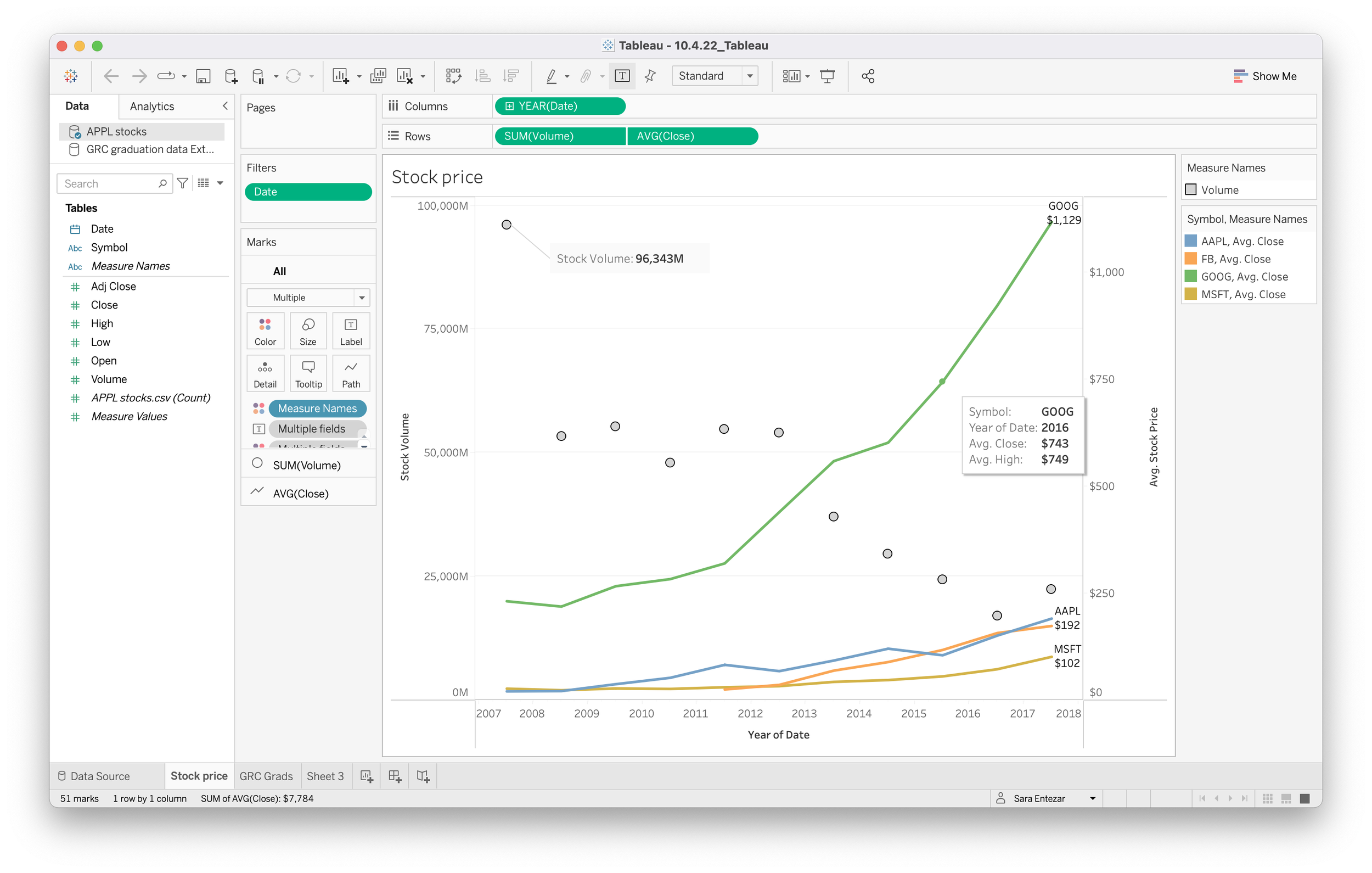
This packaged Tableau file provides three tables:
Dual-axis scatter plot analyzing 10-year stock price fluctuations of Apple, FB, Google, and Microsoft
Scatter plot analyzing 5-year gender representation trends in Cal Poly’s Graphic Communication Dept.
Bar chart analyzing 5-year discrepancies for in-state vs. out-of-state and on-campus vs. out-of-state costs of attendance.
Analysis of San Diego AirBnb Data using Tableau’s Sheets, Dashboards, and Story Tools
This packaged Tableau file provides a story of San Diego’s AirBnb 2022-2023 pricing trends. The charts include:
Stylized map showing distance from SD Zoo.
Tree map of median neighborhood prices.
Highlight table of people accommodation, bathroom count, and median price.
Scatter plot of median prices over time.
Dual-axis scatter plot of price and count of available properties over time.
Dual-axis scatter plot of median prices and adjusted median prices over time.
Analysis of CA STI, Education Attainment, and Personal Income Data using Tableau’s Sheets, Dashboards, and Story Tools
This packaged Tableau file provides a story of Californian women’s education attainment and personal income as potential predictors of STI prevalence rates (2008–2014). Data was sourced from data.ca.gov/dataset. The charts include:
Scatter plots of education attainment and personal income over time.
Highlight tables of personal income pivoted by education attainment.
Stacked bar graphs depicting population of women in each personal income bracket based on education attainment. Compare 2008 and 2014.
Scatter plots of average number of STI cases over time and average rate of STI cases over time.
Packed bubble chart of average rate of STI cases.
Dual-axis scatter plot of education attainment over time and average number of chlamydia cases over time.


