Leo Leo Gelato Packaging Redesign
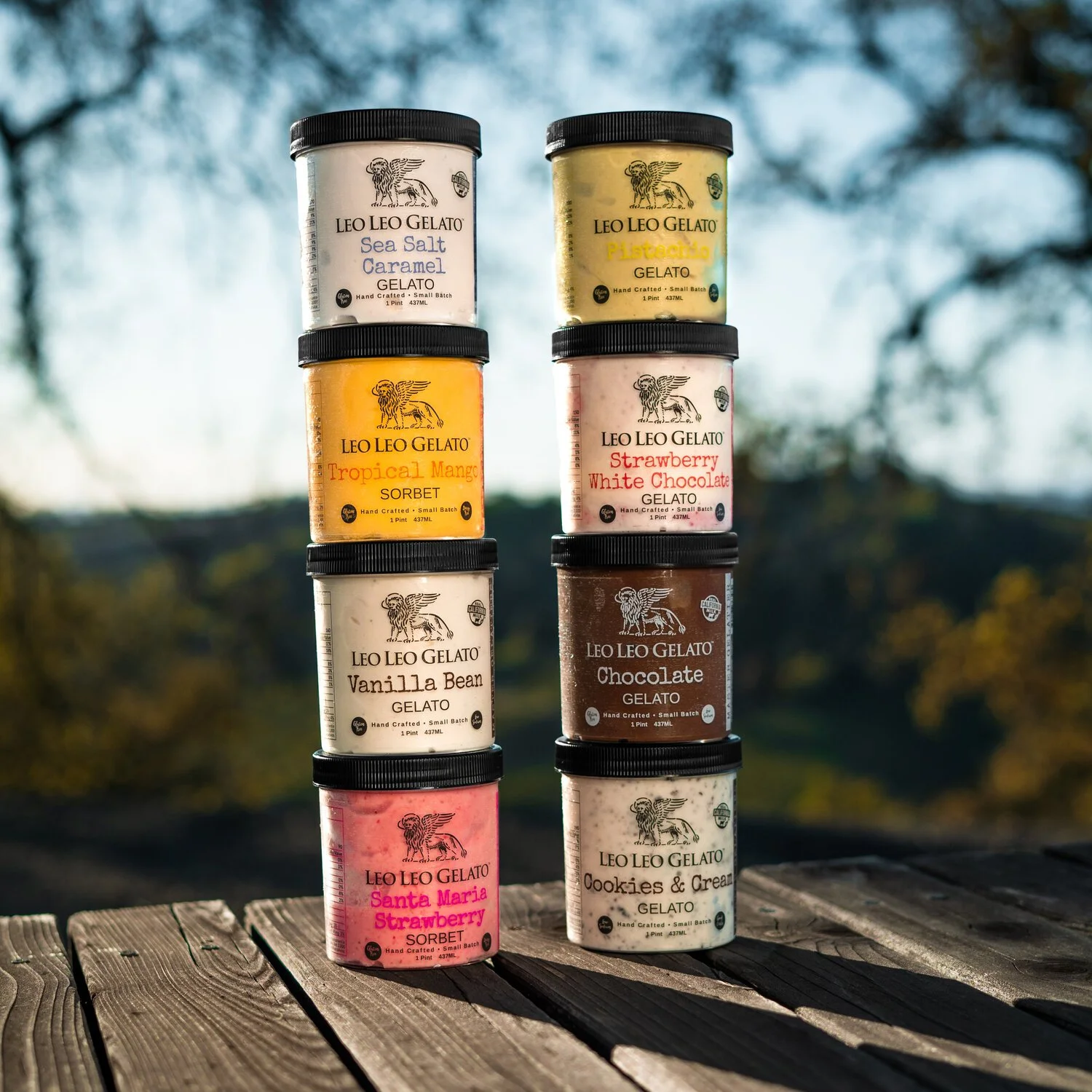
Paso Robles gelateria Leo Leo Gelato teamed up with Cal Poly’s Consumer Packaging class to task student teams with redesigning their artisan gelato and sorbetto pints. Combining owner Niccolò Lekai’s vision for the brand, market research, and our own creative liberties, our team developed an eye-catching, structurally-unique, and modern redesign.
Software: Adobe Illustrator, Esko plug-in
Key words: brand redesign, structural packaging, market research, logo design, client work,
Current State
Founding in 2010, Leo Leo Gelato specializes in wholesale and by-the-pint gelato and sorbetto. While the family-owned gelateria prides its artisanal, hand-crafted products, the pint packaging offers limited insight into the brand’s ethos.
The current pints use food-safe polyethylene terephthalate plastic with a twist-off lid. Its design is straightforward, though does not carry the sophistication expected in hand-crafted products.
Inspiration & Target Audience
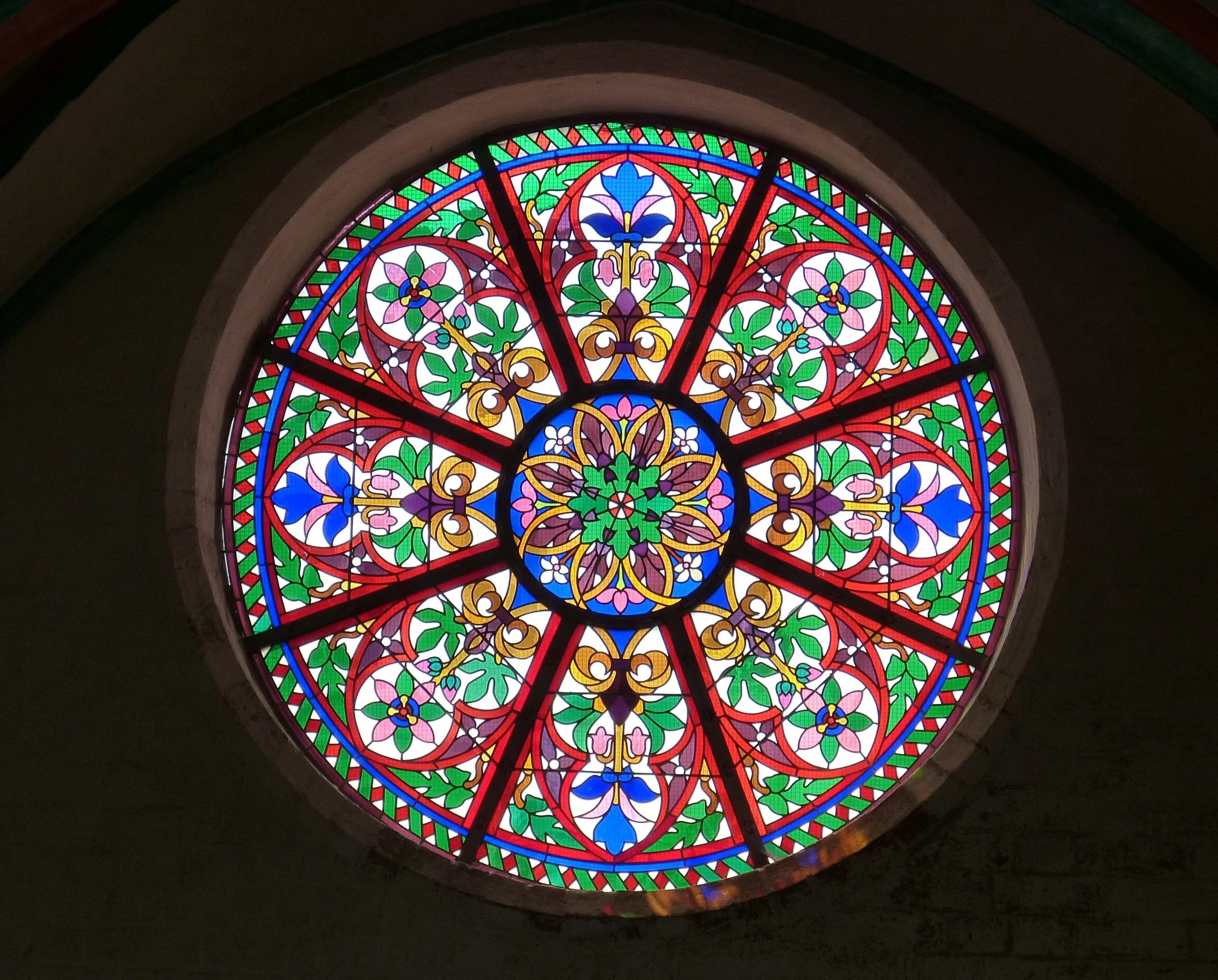
In the early design phases, I drew inspiration from characteristic features of Florence, Italy, including lions, brick terraces, stained glass, medieval script, and more.
While we wished to maintain the sophistication and artisanship of the gelateria, market research dictated an absent 18–25 year old audience. Thus, modern and vibrant design choices aimed to target this underrepresented audience.
Early Development
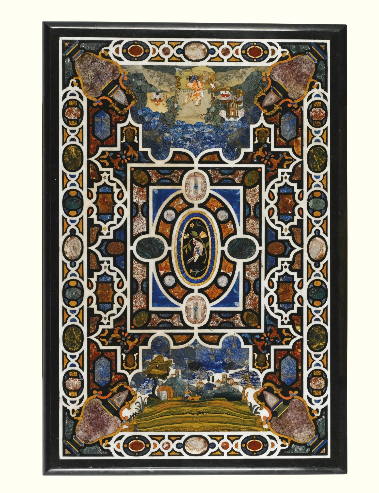
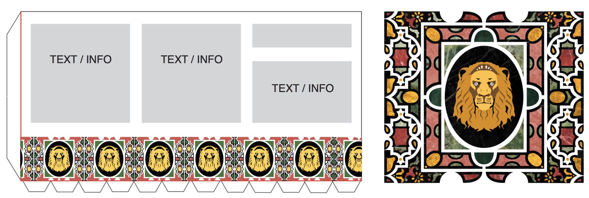
I selected this Italian inlaid table top from ~1620 as the key reference for the packaging artwork. Early designs showcased a lion as well as bold mosaic colors and textures. However, upon rendering, this graphic was too noisy and incongruent to other design features.
Further development of the packagaing artwork showcases gradual simplification. The design served as a pattern and required an appropriate balance of simplicity and detail.
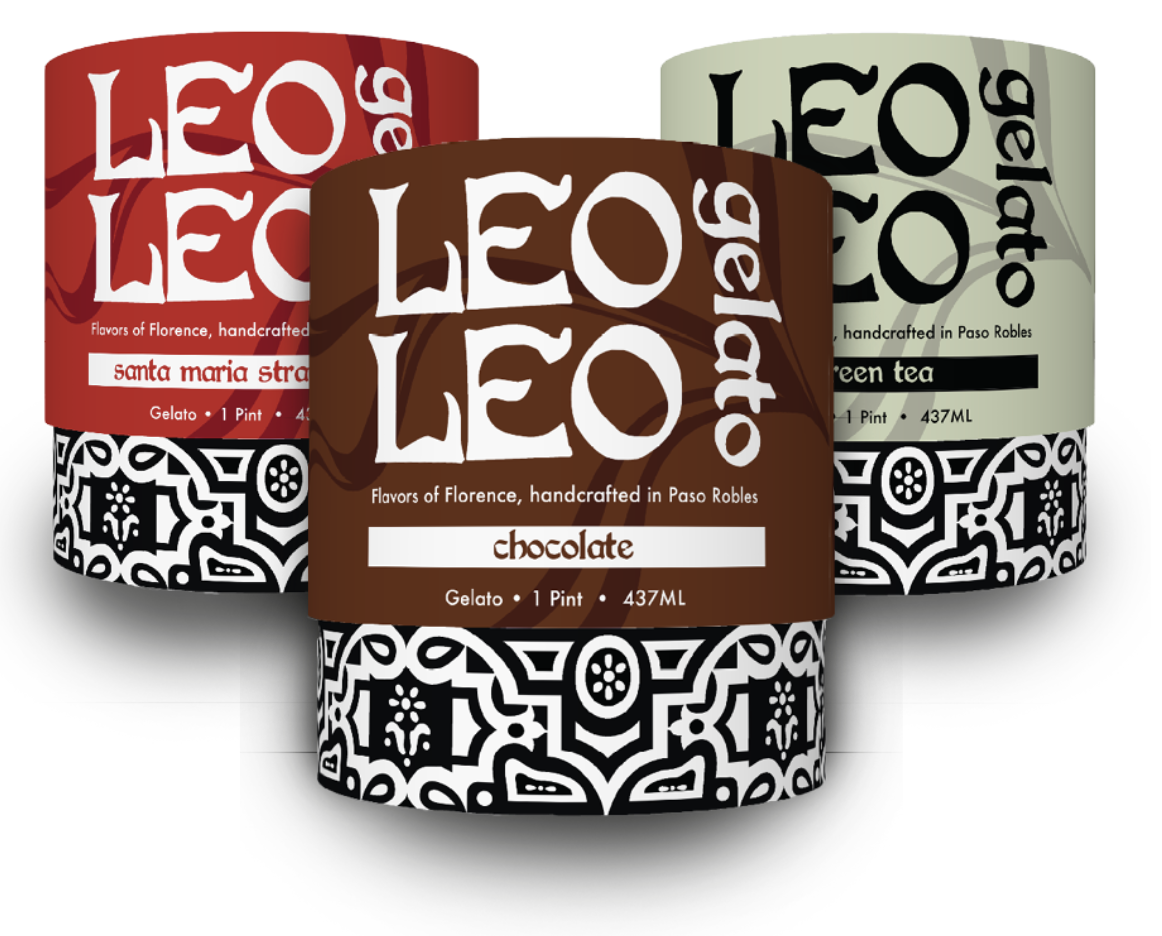
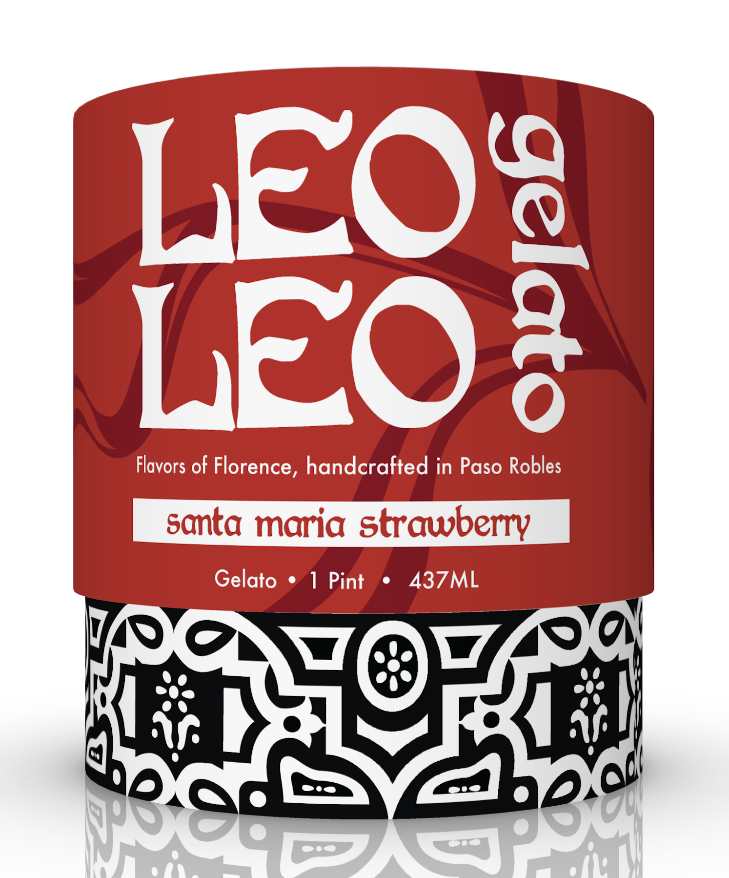
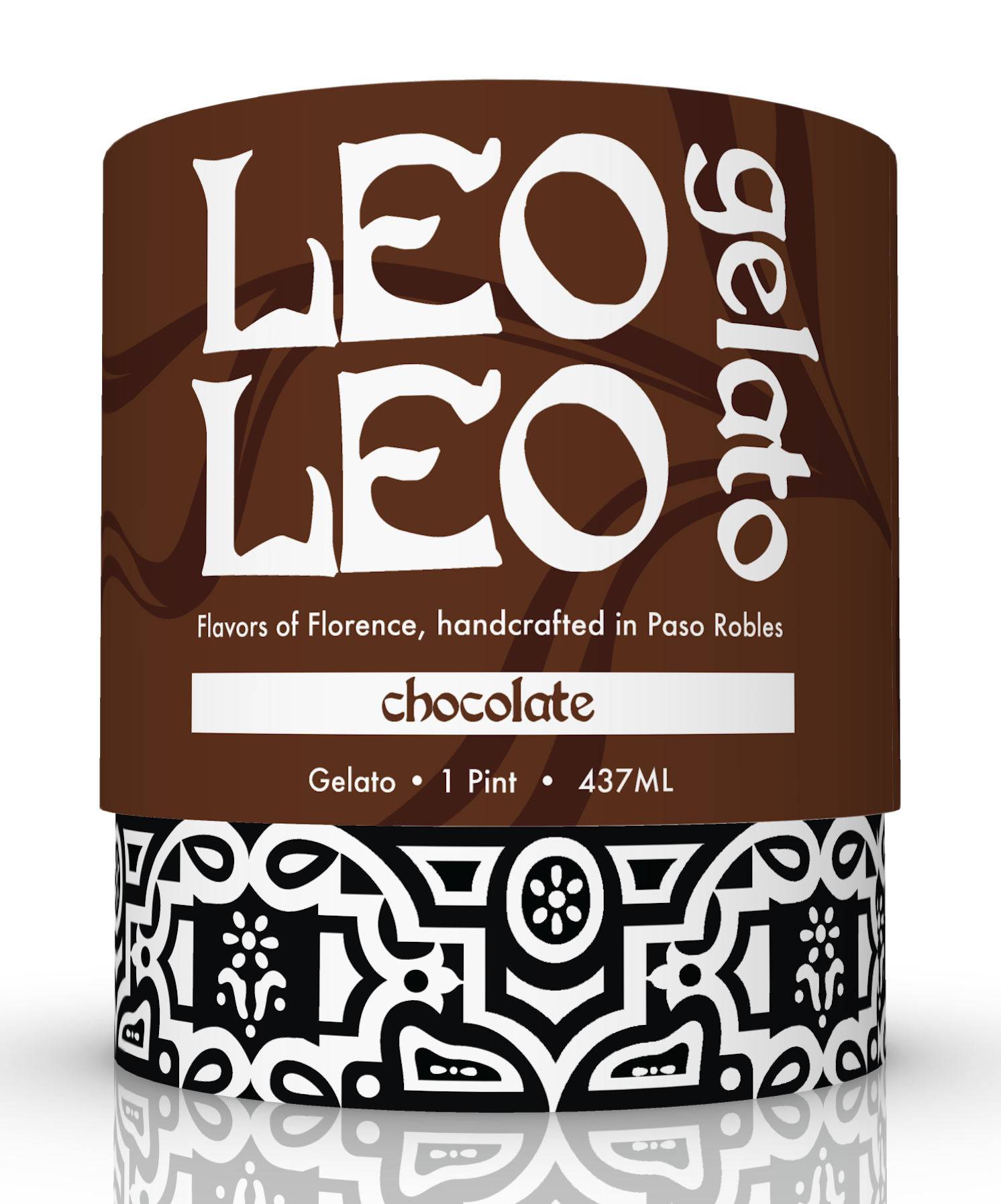
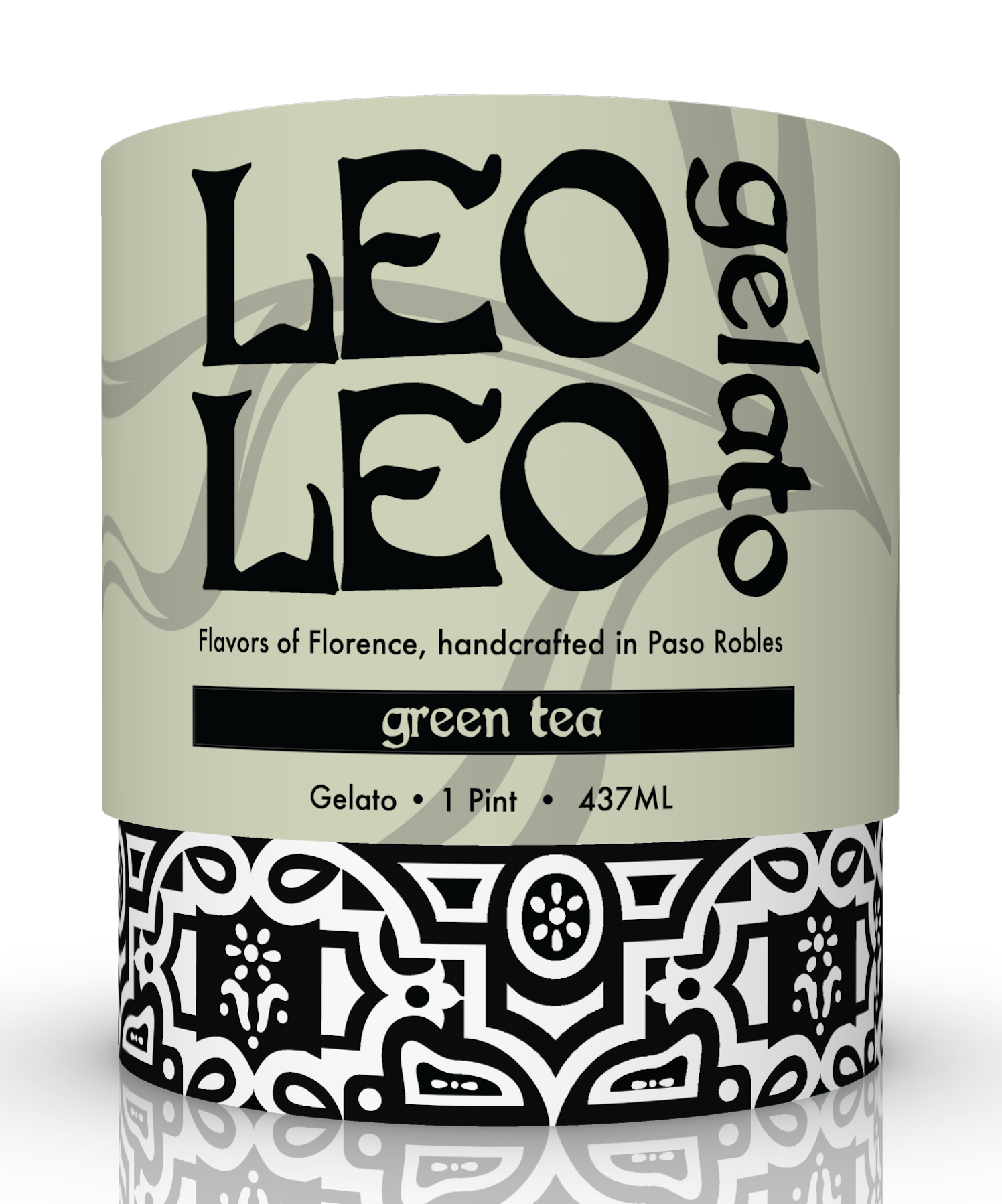
I ultimately settled on black-and-white for the pattern, allowing vibrant color permutations to differentiate the pint flavors. Further, I aimed for a pleasant billboarding effect when stacked on a shelf.
Other Visual Elements
Other visual considerations included markers of quality and company ownership, as presented by these icons built on Adobe Illustrator.
Early in our brand development, the team formulated a clear brand narrative that reflects high quality ingredients and small-batch family operations. Depicting owner Niccolò Lekai attached a face to the brand, establishing identity and trust.
Logo development first considered the tradition and artisanship of gelato, then made sure these old-European typefaces were clean enough to adhere to our modern packaging design.
The selected typeface was White Storm, which balanced tradition and modernity, incorporated strong contrast between thick and thin lines (similar to our pattern), and has an inexpensive commercial liscense.
Flavor variations were presented through vibrant color permutations. The more saturated the color of the packaging, the bolder the flavors are perceived to be (1). Further, research indicates that lighter colors, while associated with healthiness, may backfire to trigger negative taste associations (2).
I opted for a bold color palette to enhance flavor perceptions, improve display visibility, and appeal to a more vibrant, youthful audience.
1. From a meta-analysis by C. Spence in the text: Multisensory Packaging Design: Color, Shape, Texture, Sound, and Smell 2. from experiments by Mai et. al 2016: Light and Pale Colors in Food Packaging
Dieline & Compiled Design
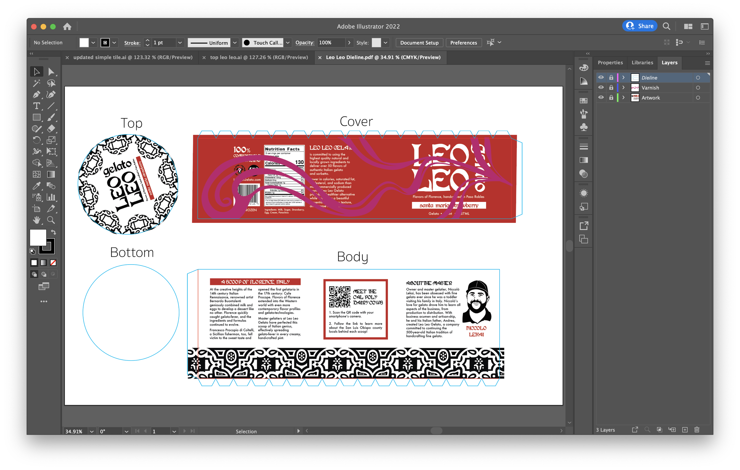
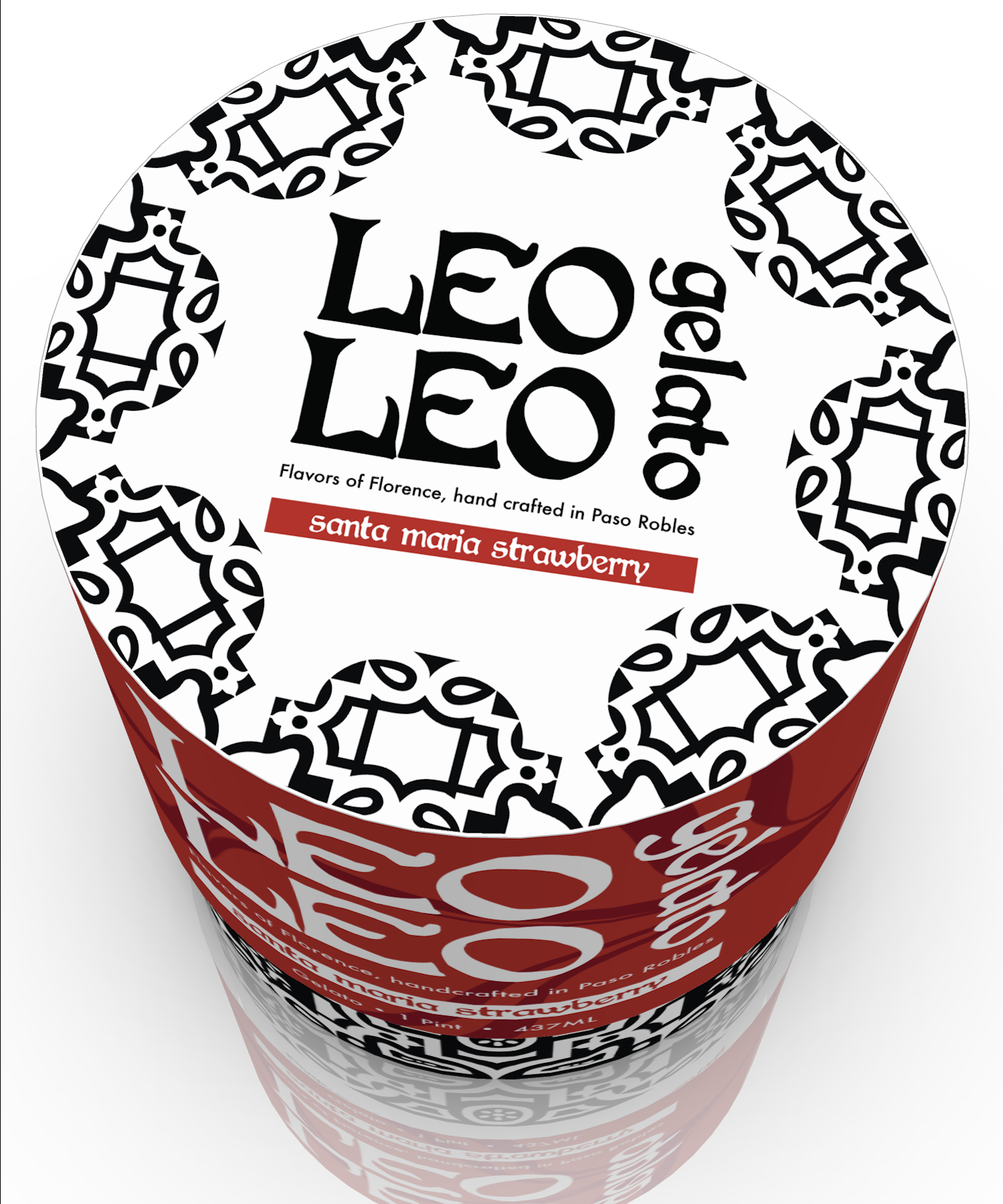
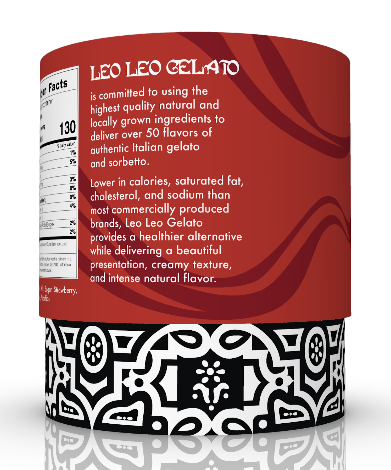
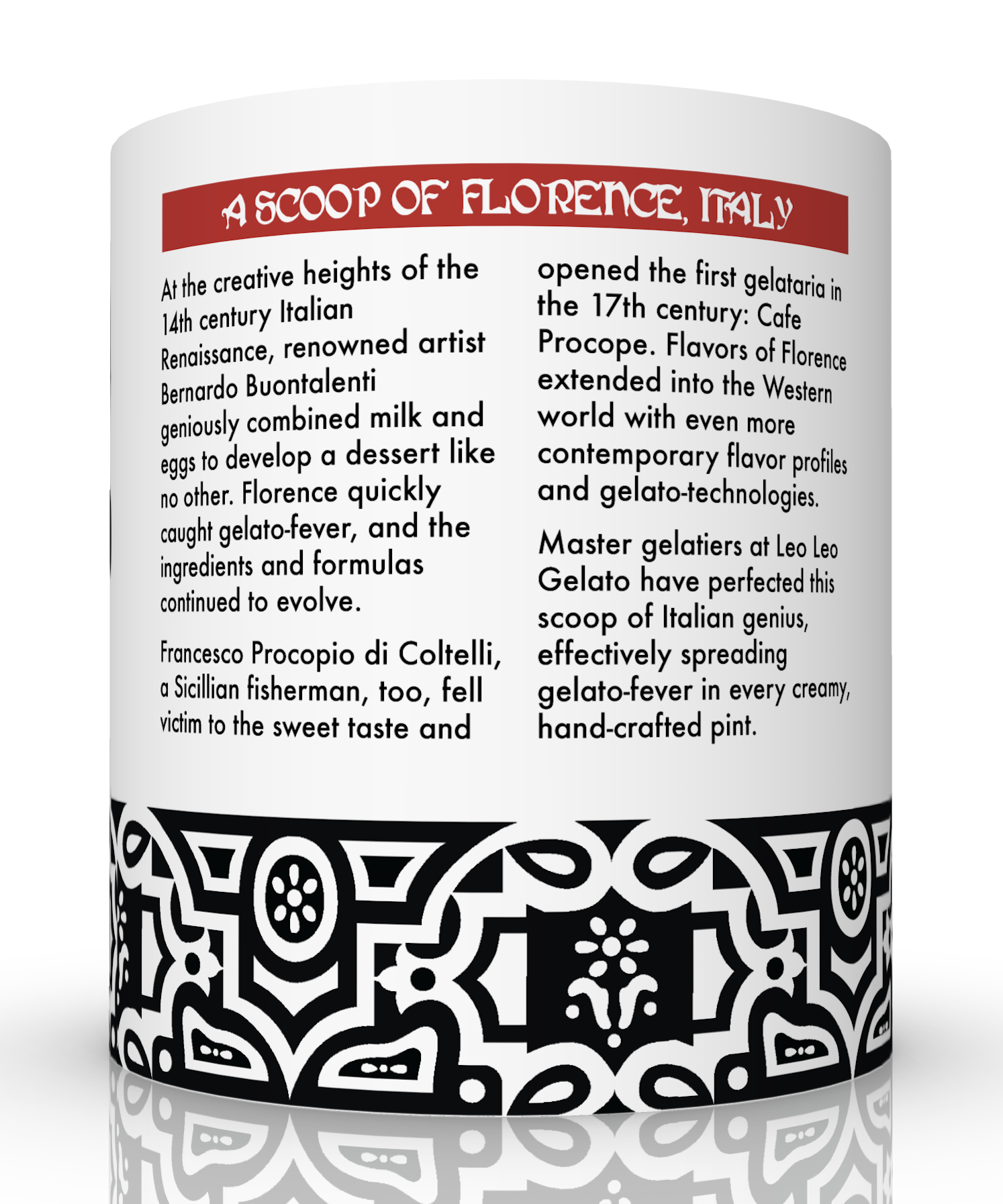
The the structural design of the pint included a long 3/4 lid, intended to maximize surface area and achieve a unique opening experience. I created the appropriate dielines on a nonprinting layer in Illustrator.
The compiled design included:
Dieline layer, artwork layer, and varnish layer
Nutrition label, ingredients list, and barcode requirements
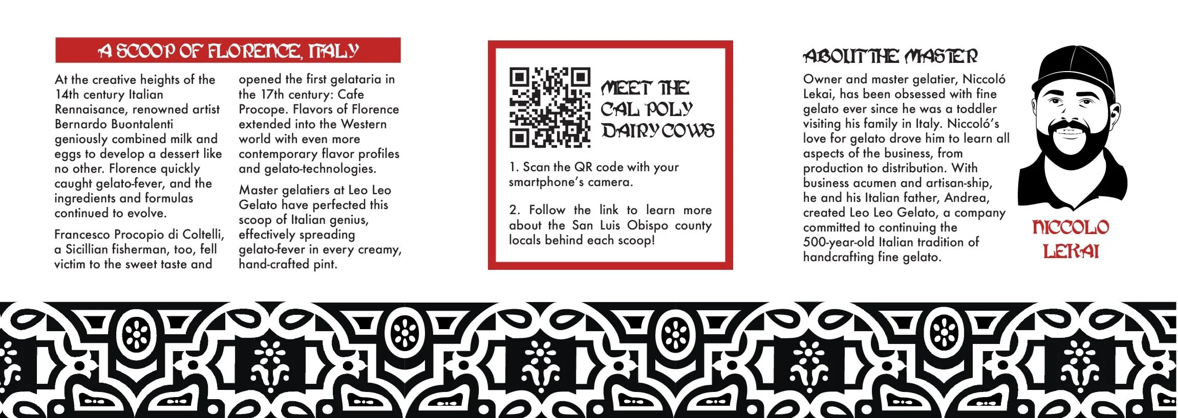
About the brand and its products, brief history of gelato, and about the gelato master Niccolò
AR experience via QR code
Et viola!
I used Adobe Illustrator’s Esko plug-in to create 3D renders from my 2D dielines. Play the video below to view the rendering in-app.



Project Reflection
The overall design was entirely illustrated and organized by myself, with the exception of the swirled varnish. As the first project of its kind, I am extremely satisfied with the result and believe if would be a product I’d pick up on the store shelf.
This project helped demonstrate the client-designer experience early in my graphic arts career, including an initial brief, transfer of filed, check-ins, and a final presentation pitching our design. Further, I gained fruitful collaboration experience, working alongside three others and distributing tasks as they suited our expertise.


