Son Care Branding Redesign
San Luis Obispo County's Son Care Foundation joined Cal Poly’s Managing Quality in Graphic Communication course to explore potential marketing and branding solutions. The foundation hosts many nonprofit organizations, including sister organizations Thousand Hills Pet Resort, Gentle Touch Pet Training, and New Life K9s Service Dogs.
A Son Care representative discussed project goals and branding expectations; my individual tasks focused on brand development and cohesion.
Software: Adobe Illustrator, InDesign
Key words: brand development, logo design, branding guidelines, client work
Current state
As expressed by the Son Care representative, the three organizations have limited visual cohesion, and thus little organizational cohesion.
Gentle Touch and Thousand Hills incorporate similar colors palettes and line art logos, though inconsistent typeface choices. The former two juxtapose the patriotic colors and typefaces of New Life K9s.
Early Process
I used the following key concepts/words to formulate my early sketches and subsequent typeface and palette choices:
Friendly, playful, and gentle
Lively, colorful
Diversity of dog breeds
These thumbnails were loosely drawn in my sketchbook paying little mind to detail.
Continued Process
These refined early iterations were created using Adobe Illustrator and presented to my student team, where three representative logos were chosen.
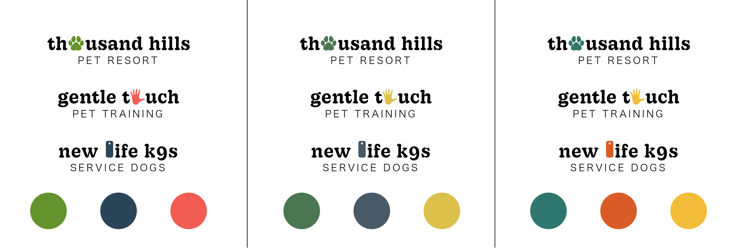
Our potential color palettes shown below were inspired by the same core concepts of playfulness and liveliness. I selected three complimentary colors: each organization claims its own dominant color while using its sister organizations’ dominant colors as its secondary and tertiary colors.
These logo and palette combinations were shared with our Son Care representative to be reviewed and chosen between.
Final Logos
Pictured are the final logos for each organization, including scalable alternative logos. Each logo uses recognizable iconography based on the organization’s name and purpose, and are designed to compliment one another’s color palette.
Upon completion, the updated colors, typefaces, and logos were compiled into a brand guidelines slideshow, pictured below. I created this slideshow using Adobe InDesign.
Project Reflection
Logo development advanced my skills in Adobe Illustrator, applying new tools to create vector graphics and type. I’ve become comfortable with the pen tool. Additionally, research throughout this project demonstrated the importance of scalable logo design, which I’ve valued and incorporated in my logos since.
This project demonstrated my dedication toward brand development and logo design, having assigned myself the role of “designer” on my team. While I was granted plenty of creative liberties, working simply from key words and ideas provided from our Son Care representative and the respective websites, this project introduced me to regular client check-ins and limitations. This included limited color and design choices, stricter timelines, and managing remote communications.


