Magazine Spread Design
This magazine spread was developed for my Digital Typography for Print and Web course and sought to familiarize students with typeface characteristics, page layout, and Adobe InDesign tools. With free range to select the article contact, I was inspired to frame a blog post about Reza Abedini, often considered to be the father of contemporary Iranian graphic design.
Software: Adobe Photoshop, InDesign
Key words: page layout, formatting styles
Drawing from the article
This 2020 article posted by branding agency Grapheine spotlights Reza Abedini, a graphic designer who flourished post-Islamic Revolution. An excerpt from the article writes:
“[In Iranian graphic design,] words and images intermingle to become one, letters become illustrations. One cannot grasp the meaning of Iranian graphic design without considering the importance of the text for this culture.”
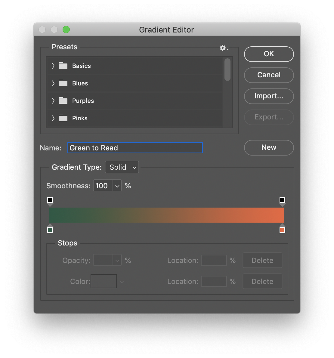
I wanted to incorporate the featured image of Abedini, though the black-and-white portrait fell flat against the vibrant tones of his work. I applied gradient maps on Photoshop and layered them in Illustrator to create the effect pictured. Here, I depicted a sense of vision, vibrancy, and forward-thinking.
Working in InDesign
In InDesign, I created a 5-column grid and built my spread upon it, considering variability of images as I organized the layout. Notable InDesign tools used include:
Paragraph styles
Hidden characters
Text threads
H&J Violations
Text wrap
Edits…
The magazine spread went through several iterations before landing at its completed state below.
Preflighting and in-app edits begin the process, while printed versions follow to confirm proportions, colors, text sizes, contrast, and white space.
Spread Features
The spread features 5 pages and includes:
Headings — Coolvetica 16/16
Subheadings — Coolvetica 12/14
Bulleted lists — Sinhala Sangam MN 10/14
Folios and captions: Sinhala Sangam MN 9/11
Project Reflection
Further, typeface exploration led me to discover my favorite typeface: Coolvetica, a sans-serif typeface inspired by logotypes from the 1970s. You can find me using Coolvetica is a number of other creative projects, including this very portfolio!
This project improved my familiarity with InDesign and the editor tools that enhance readability, hierarchy, and visual balance. These include the “lights-on” feature which displays hidden characters, text threats, H&J violations, and other helpful tools.


