PROVE Lab Brand Refresh
Cal Poly’s Prototype Vehicles Laboratory is a non-profit student organization that designs and manufactures record-breaking alternative-energy vehicles. Since joining the team in 2019, I’ve refreshed the organization’s overall media presence and gained considerable learn-by-doing experience in the process. The following project is divided into website, social media, and marketing material development, all of which served to reinvigorate this ambitious organization.
Software: Adobe Illustrator, InDesign, Instagram, Facebook, WIX, Canva
Key words: brand standardization, digital media management, print collateral, insights
Building a Website
The PROVE website formally consisted of a single, un-stylized landing page compiled during the organization’s conception in 7 years prior.
My first task on the team required a complete redesign of the website, a process that consisted of luxury vehicle branding study, familiarization with website development tools, and a translation of the program managers’ vision for the organization. I drew early inspiration from manufacturers such as Tesla, Aston Martin, Koenigsegg, and BMW.
I created the website on WIX, a tool I have become very familiar with over the last 3 years. Though limited in design capability, it was important to keep the website platform accessible to non-designers in the instance there aren’t any on the team.
WIX offers useful insights on website traffic, including site sessions, number of unique visitors, and average session duration. Since the conception of the website, I have been able to observe visitor behavior and high traffic periods. Insights reflect increased website visits during club showcase, recruitment, and crowdfunding periods.
www.provelab.org
With a clean black-and-white skeleton, the PROVE website was redeveloped to present values of learn-by-doing, professionalism, and ambitious work.
Social Media
At the time of joining the team, all social media platforms had been abandoned for over a year. Although the organization requires the attention of sponsors and industry leaders, student engagement is also crucial for recruitment, networking, and member morale.
Instagram is our main hub for social media content focused toward student engagement.
To streamline media workflow and provide visual cohesion, I created two post templates in Canva. These post templates were designed to be accessible to non-designers.
While I maintained the general organizational feel, template fonts were altered due to Canvas’ limited selection (now using Aileron). The websites’ black and white theme was switched to an off-black and off-white to better compliment surrounding images and mitigate high-contrast eye strain.
Insights
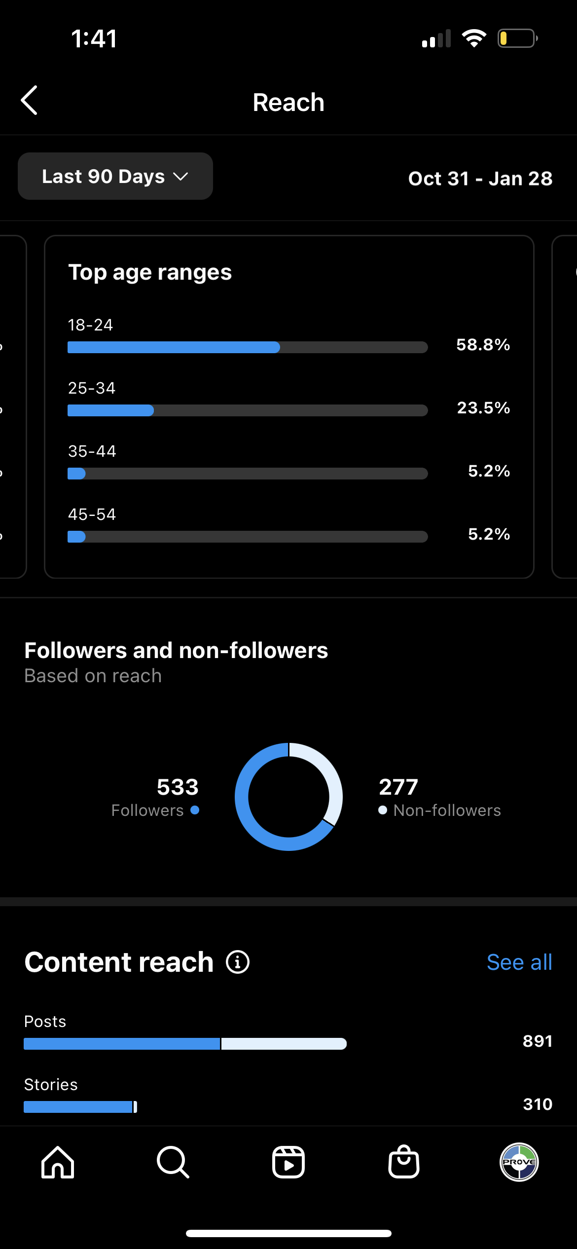
Instagram’s insights feature provides fruitful data on overall account performance and individual post engagement. Data trends reflect a preference for student and image-based content — information I considered as I developed new posts. A predominantly 18-24 year old viewership is also considered when developing content.
Marketing Materials
With the establishment of the website and social media platforms, marketing the club was long overdue. Marketing materials included posters, pamphlets, one-sheets, business cards, t-shirts, pint glasses, and a quarterly periodical.
I was able to translate the organizational image onto these marketing materials, balancing effective graphic communication, brand recognition, and creative liberties.
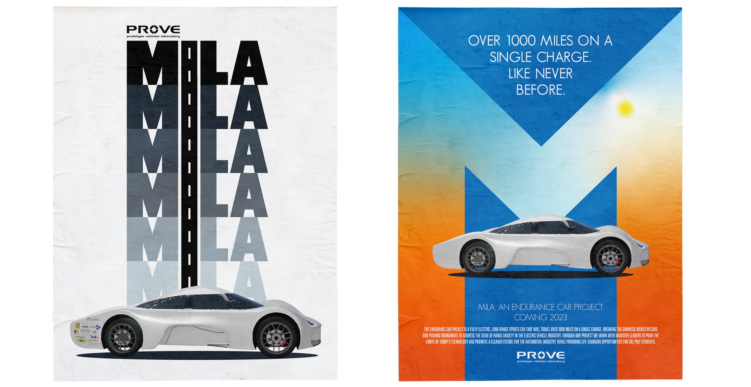
Posters were designed to creatively spotlight Mila. These pushed the boundaries of automotive marketing and employed illustration and image manipulation tools in InDesign, Illustrator, and Photoshop.
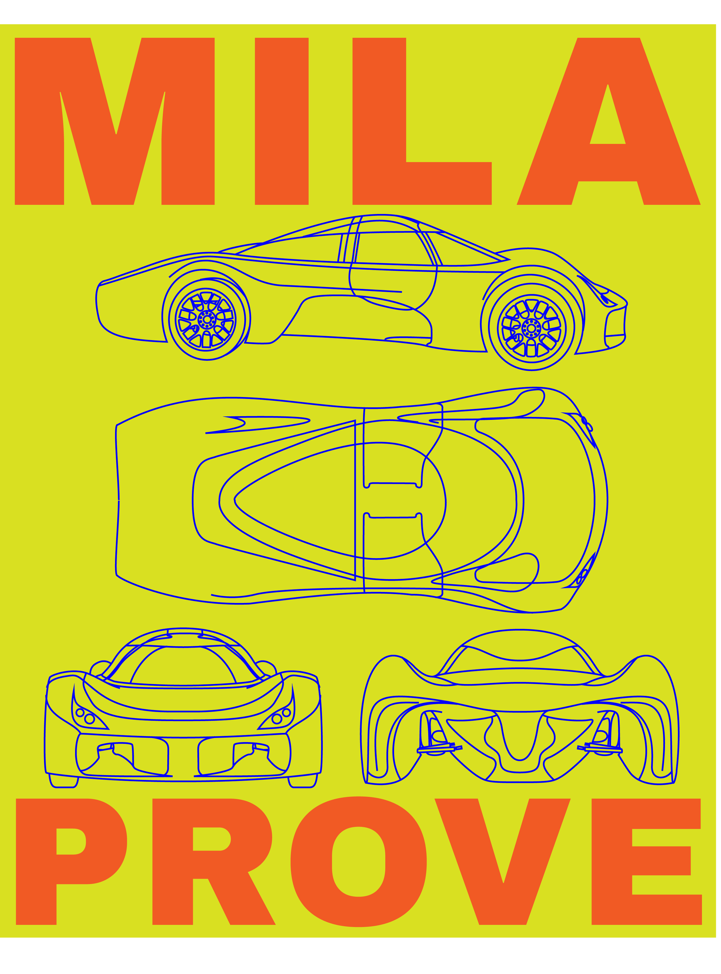
From left to right, these posters explored the use of paper textures to enhance 2D designs, wire frame illustrations, film-inspired applications, unconventional gradient maps, and typography.
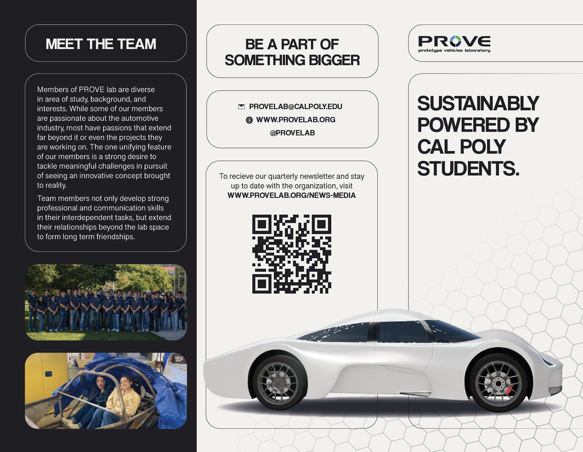
These informational tri-folds were created for recruitment events and other tabling needs. They were built on InDesign using tri-fold design conventions.
System infographics or one-sheets were created for tabling events, spotlighting a technical overview of each of the car’s systems. They were built on InDesign and printed 17.75"x11.75".
T-shirts
I fashioned team apparel for members who called for a simple and wearable design, free from overly clunky or stylized elements. We landed on a “patent print” style that displays the front, back, top, and side of the car using wire-frame illustrations created on Illustrator.
Pint glasses
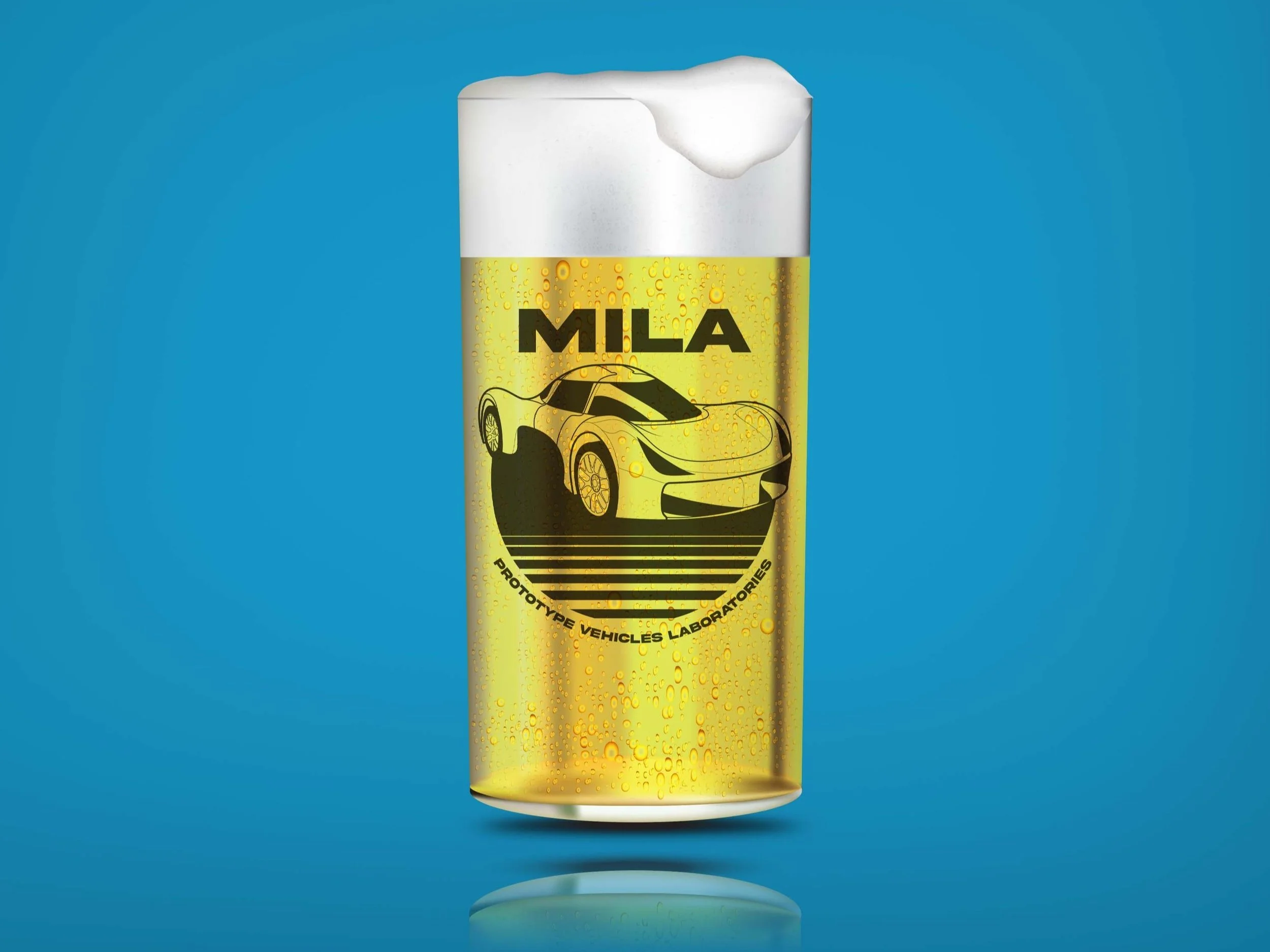
Members requested “PROVE-themed pint glasses” as additional marketing material, mainly for purchasing within the organization. I was inspired by classic retrowave art styles to create this pint glass design.
Business cards
Business cards were developed for distribution and organizational awareness at tabling or trade show events. While perhaps overly conventional, we opted for a hexagonal motif to evoke modernity, strength, and engineering.
Quarterly Periodical
I proposed the PROVE periodical as an opportunity to stay connected with alumni, parents, and sponsors, all of whom we rely on for financial and advisory support.
The periodical is sent out quarterly and reviews organizational changes, recent events, and project milestones. It also spotlights our sponsors, which is visibility we leverage when pursuing partnerships.
I built the periodical on Adobe InDesign, incorporating a grid, paragraph styles, and parent page elements to streamline consistency across pages. I took this as an opportunity to deviate from standard black and white marketing colors (seen in the pamphlets and one-sheets above) and opted for a vibrant violet-cyan gradient.
Each quarter’s periodical adheres to the standard template with content and image formatting changes as necessary. When complete, the document is packages for easy re-opening and duplication.
Project Reflection
Year after year, my experience and skills as a designer advanced, and I was subsequently able to funnel that knowledge into the club. I have been able to reap the benefits of organizational commitment, including trust from my peers, risk taking in my designs, and improvement in my output. While my focus on content creation trickled in my third year since redirecting focus toward program management, I look forward to a future that combines both.
My opportunities as a designer at PROVE have been foundational to my personal and professional development. The environment of the club was comparable to a start-up, with high degrees of autonomy, rapid changes and output, and flexibility to mold the organization’s image as I saw fit. There were no previous graphic designers on the PROVE team and little direction from superiors, leaving me with a surplus of learn-by-doing experience.
Image attribution: Image by rawpixel.com on Freepik; Image by pongpongching on Freepik; Image by Vectonuata on Freepik


